The Complete Guide to Design Tokens - Architecture, Three-Layer Model, and DTCG
Design tokens are named values that carry visual decisions across every platform. This guide covers the three-layer model, DTCG format, and how to structure tokens that survive redesigns.

Design tokens are the named, versioned values that represent every visual decision in a design system - a color, a spacing unit, a border radius, a shadow, a font size. Tokens give those decisions names and structure that travel from Figma to iOS to Android to web without anyone copying values by hand.
Every time a designer changes a color in Figma and an engineer changes a hex value in three different files across two codebases, the process is broken. Design tokens exist to fix that disconnect by creating a single source of truth shared between tools and platforms. A token is not just a variable - it is the authoritative record of a design decision, with a name that communicates intent and a value that can be transformed for any target platform.
Why Design Tokens Matter for Cross-Platform Systems
The value of design tokens is not just consistency, though that is important. The deeper value is that tokens create a single source of truth for visual decisions that can be consumed by Figma, iOS, Android, React Native, and web applications from the same location. When a brand color changes, the change is made in one place and propagates everywhere the token is used - without manual updates in each consuming codebase.
To make this concrete: before a token system, I worked with a financial services client whose brand color lived in seven separate locations - a Figma library, an iOS Swift constants file, an Android colors.xml, a CSS variables file, a SCSS variables file, a React Native StyleSheet, and a Tailwind config. A brand refresh required coordinating updates across three engineering teams and took four days to complete, with two missed instances discovered in QA. With a token system feeding all seven output formats from a single source, the same brand color change takes one pull request and one CI pipeline run.
The platforms that a well-structured token system can serve from a single source include: web (CSS custom properties, SCSS, Tailwind), iOS (Swift, Objective-C), Android (Kotlin, XML resources), React Native (JavaScript/TypeScript StyleSheet), and documentation systems like Storybook. The token format does not change by platform - only the output transform changes, and tools like Style Dictionary handle that automatically.
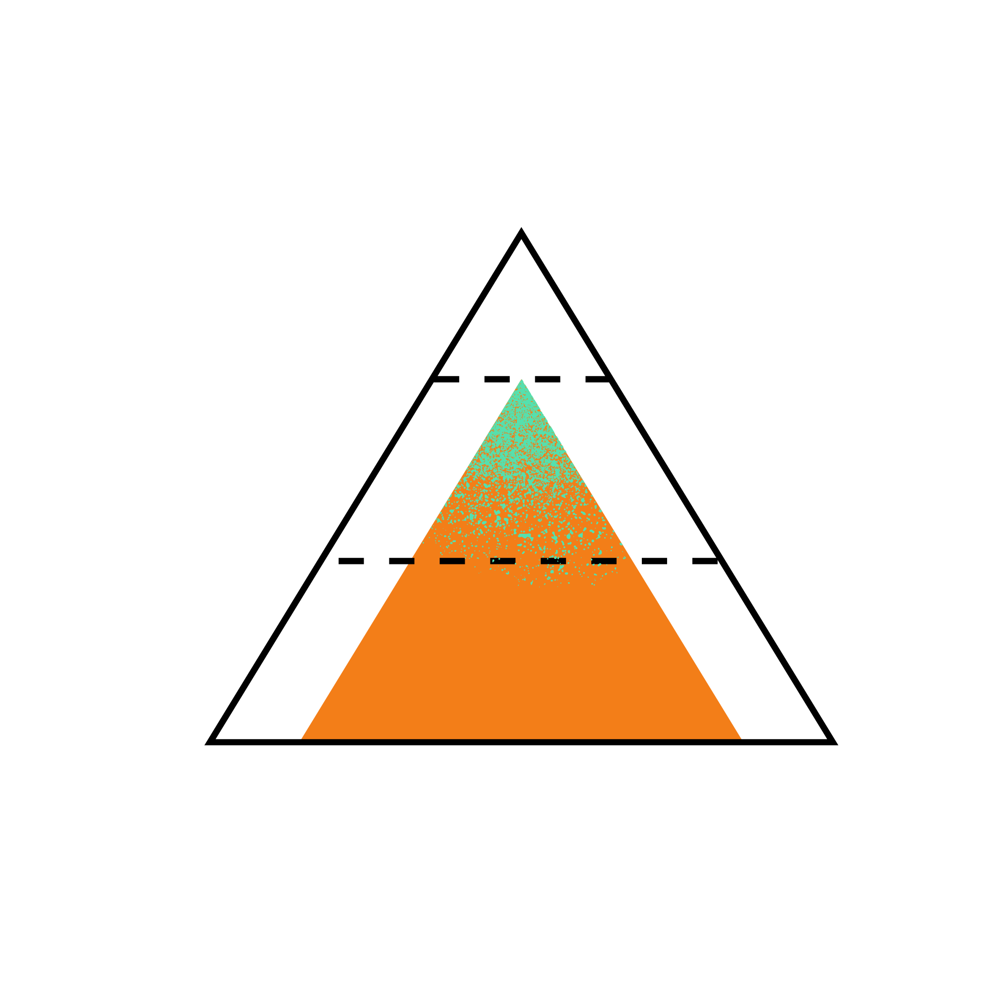
The Three-Layer Model: Why Not Two Layers, Not Four
The most durable token architectures use three layers of abstraction. Understanding why three layers - not two, not four - is the key to building a system that survives redesigns and brand changes.
Layer 1: Primitive tokens are the raw values. Specific hex codes, pixel values, font family names, numeric scale steps. These are facts about the palette, the type scale, the spacing scale. They have no semantic meaning - they are just the atoms of the system.
{
  "color-blue-500": { "value": "#0052CC", "type": "color" },
  "color-blue-600": { "value": "#0043A8", "type": "color" },
  "space-4": { "value": "16px", "type": "dimension" },
  "space-6": { "value": "24px", "type": "dimension" }
}
Layer 2: Semantic tokens assign meaningful names to primitive values. color-primary, spacing-component-padding, typography-heading-size. These names communicate intent - what the value is for, not what it literally is. This is the layer that makes a system durable. When a redesign changes the primary blue from #0052CC to #0066FF, only the semantic token’s reference changes. Every component using color-primary updates automatically.
{
  "color-primary": { "value": "{color-blue-500}", "type": "color" },
  "color-primary-hover": { "value": "{color-blue-600}", "type": "color" },
  "space-component-padding": { "value": "{space-4}", "type": "dimension" }
}
Layer 3: Component tokens map semantic values to specific component contexts. button-background, card-padding, input-border-radius. These exist for components that need to deviate from the semantic defaults, or for components whose token references need to be overridable by themes or brands.
{
  "button-bg": { "value": "{color-primary}", "type": "color" },
  "button-bg-hover": { "value": "{color-primary-hover}", "type": "color" },
  "button-padding-x": { "value": "{space-component-padding}", "type": "dimension" }
}
The reason for three layers rather than two is separation of concerns. If components reference primitive tokens directly, a brand color change requires updating every component token. If components reference semantic tokens directly, you lose the ability to have component-specific overrides without polluting the semantic layer. Three layers keeps each concern isolated - and isolation is what makes the system maintainable when it is serving 50 or more consuming applications.
In my experience building token architectures from scratch at enterprise scale, teams that try to shortcut to two layers (primitives and component tokens, skipping semantic) always pay for it during the first major redesign. They discover that “change the primary color” now requires updating 40 component tokens instead of 1 semantic token.
What Is the W3C DTCG Specification and Why Does It Matter Now?
The W3C Design Token Community Group (DTCG) has published a specification that defines a standard JSON format for design tokens. The specification - available at the W3C Design Tokens Community Group - defines how tokens should be structured, how types should be declared, and how composite tokens (like typography or shadow) should be represented.
Adopting this standard means tokens can move freely between Figma, Tokens Studio, Style Dictionary, and any other tool that implements the specification. Before DTCG, every tool used a slightly different format and “importing tokens” was actually “writing a custom transform.” The specification ended that problem.
A concrete example of interoperability in practice: a token defined in Tokens Studio for Figma in DTCG format can be exported and fed directly into Style Dictionary 4.x (which has native DTCG support) without any custom transform layer. The token flows from design tool to build pipeline to platform output without a handoff translation step. Before DTCG, every tool used a slightly different format, and “importing tokens” from Figma into Style Dictionary meant writing a custom transform to bridge the format gap - typically one to two days of engineering work per design tool upgrade.
If you are starting a new token architecture today, build to the DTCG format from the beginning. Retrofitting it later is painful - not technically impossible, but it requires auditing every token in the system, restructuring the JSON hierarchy, and updating every consuming pipeline. I have done this retrofitting exercise twice, and both times the effort was larger than building to DTCG from the start would have been. Building on it from day one means every future tool that adopts the spec works with your tokens immediately, with no transform layer to maintain.
Tools that currently support the W3C DTCG design token format include: Tokens Studio for Figma, Style Dictionary 4.x, Theo (Salesforce), Amazon Style Dictionary, and a growing number of design tool plugins. The ecosystem is still maturing, but the trajectory is clear - DTCG is becoming the baseline interoperability standard for design token tooling.
Token Naming: Where Systems Succeed or Fail in Practice
Naming is where token systems succeed or fail in practice. A well-named token communicates intent, survives redesigns, and is legible to both designers and engineers. A poorly named token creates confusion, encourages workarounds, and accumulates technical debt.
Three principles have held up across every token system I have worked on:
Name by role, not by value. --color-primary survives a rebrand; --color-blue does not. --space-component-padding communicates intent; --space-16 communicates nothing useful beyond the pixel value. Role-based names make the semantic layer legible to designers working in Figma, who think in terms of “what is this for” rather than “what is the exact value.”
Use consistent prefixes by category. color-, space-, typography-, radius-, shadow-, motion-. Consistent prefixes make token autocomplete useful in editors and prevent the naming ambiguity that accumulates in large systems when there are no conventions.
Keep primitive token names explicit. color-blue-500 is better than color-blue-mid because it positions the value in a scale, making it easier to reason about the full palette. Palette scale naming (50 through 950 in increments of 50 or 100) is a convention borrowed from Tailwind that works well for token primitive layers.
Frequently asked
Questions
A named, versioned value that represents a single design decision - a color, a spacing unit, a font size. Tokens give decisions names that communicate intent (color-primary, space-component-padding) rather than raw values (#0052CC, 16px). One change propagates across every platform that consumes the token.
Primitive tokens are raw values: specific hex codes, pixel values, font family names. Semantic tokens reference primitive tokens and give them a meaningful role name: color-primary references color-blue-500; space-component-padding references space-4. The distinction matters for maintainability: when a brand changes its primary color, only the semantic token's reference changes - not every component that uses the color.
The W3C Design Token Community Group (DTCG) specification defines a standard JSON format for design tokens, including how types are declared and how composite tokens are structured. Adopting DTCG format enables interoperability between design tools (Figma via Tokens Studio), build pipelines (Style Dictionary 4.x), and output platforms - without custom transform layers.
Tools with native or strong DTCG support include: Tokens Studio for Figma (export and import), Style Dictionary 4.x (native DTCG parsing), Theo by Salesforce, and Amazon Style Dictionary. Figma itself is moving toward DTCG alignment in its variables API. The ecosystem is growing - choosing DTCG as your source format is the lowest-risk long-term bet for toolchain interoperability.
Figma Variables (introduced in 2023) map directly to the token model: a named value set per mode (light/dark, brand A/brand B) and referenced across components. Tokens Studio for Figma bridges Figma Variables and external token sources, letting a team maintain a single DTCG-format JSON file as the source of truth and sync it bidirectionally. Designers change a value in Figma; engineers pick up the updated token JSON without a handoff conversation.
Keep reading
More publications
Web Accessibility Best Practices for Modern Applications
Web accessibility best practices mean embedding WCAG compliance into your token layer, component library, and definition of done - not treating it as an audit phase after the product ships.

AI Code Review for Frontend Teams - Integrating Without Losing Engineering Judgment
AI code review for frontend catches pattern violations fast but risks crowding out the design conversations that build teams. Here is how to integrate it without losing what matters.

Building Scalable Design Systems with AI-Powered Tooling
AI-powered design system tooling automates token auditing, generates first-draft docs, and flags governance violations - freeing senior engineers for decisions only humans can make.
About the author

Sandeep Upadhyay
Principal Architect · Enterprise Design Systems · Accessibility Governance
I architect accessibility-first enterprise design systems deployed across Fortune 500 financial, insurance, and technology organizations, reducing regulatory risk, eliminating duplicate engineering effort, and setting the frontend standards teams build on for years.