Web Accessibility Best Practices for Modern Applications
Web accessibility best practices mean embedding WCAG compliance into your token layer, component library, and definition of done - not treating it as an audit phase after the product ships.
One in four American adults lives with some form of disability, according to CDC data. Building accessible products is not a compliance exercise. It is engineering judgment about where to place the constraint - and the answer is always: as early as possible, at the highest leverage point in the system.
Teams that ship accessible products consistently are not the ones running the most thorough audits. They are the ones who have embedded WCAG compliance into their token layer, component library, and definition of done before any audit was ever scheduled.
The Four Practices That Make Accessibility Structural, Not Episodic
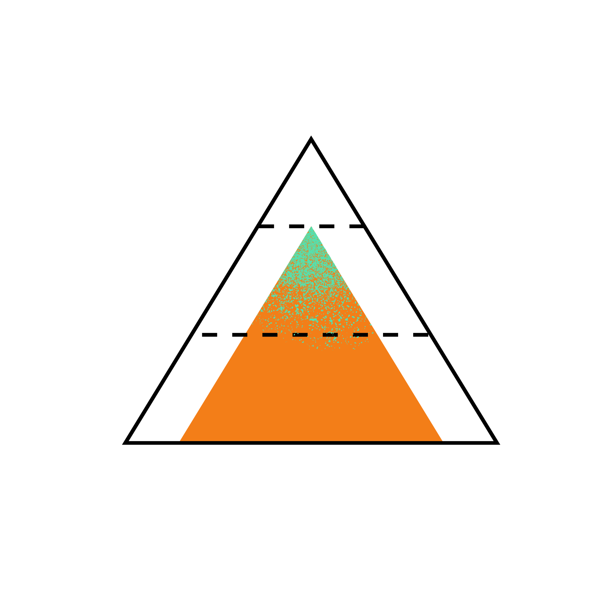
The highest-leverage web accessibility best practices operate at the system level rather than the component level. A single change to a design token, a base HTML component, or a focus management utility can improve accessibility across hundreds of components simultaneously. Individual component fixes, by contrast, require one fix per component and one regression test per fix.
The four practices that form the foundation:
- Embed WCAG contrast requirements in design tokens. If color tokens are defined with contrast ratios as a constraint, every component that uses those tokens inherits WCAG compliance automatically.
- Use semantic HTML as the base layer. The correct HTML element for the job provides keyboard behavior, ARIA semantics, and screen reader support for free. Repairing a
divwith ARIA is always more expensive and less reliable. - Implement full keyboard navigation. Every interactive element must be reachable, operable, and focusable from the keyboard. Focus management for complex widgets - dialogs, menus, carousels - must follow established patterns.
- Test with real assistive technology throughout development. Automated tools catch 30 to 40 percent of WCAG violations. The remaining 60 to 70 percent require manual testing with screen readers and keyboard-only navigation, integrated into the development cycle rather than deferred to an audit phase.
Each of these practices is described in detail below.
Build Accessibility into the Token Layer, Not the Component Layer
The most efficient place to embed accessibility requirements is at the design token layer. If the color tokens in a design system are defined with WCAG contrast ratios as a constraint, then every component that uses those tokens inherits that constraint. Accessibility becomes structural rather than something added at the end.
WCAG SC 1.4.3 (Contrast Minimum, AA) requires a contrast ratio of at least 4.5:1 for normal text and 3:1 for large text (18pt/24px regular weight or 14pt/18.67px bold) against the background. Encoding this as a constraint in the token system means defining semantic text color tokens with their background pairings and verifying the contrast ratio at token definition time, not at audit time.
A concrete implementation: the design system defines --color-text-primary as the default body text color and --color-bg as the default background. The token definitions include the contrast ratio between them as metadata, and a CI pipeline step runs WCAG contrast checks against the complete foreground-background token matrix every time the token file changes. If a token update drops the contrast ratio below 4.5:1 for a standard text pairing, the CI check fails before the change merges.
The same principle applies to focus indicator contrast. WCAG 2.2 SC 2.4.11 requires focus indicators to have a contrast ratio of at least 3:1 against adjacent colors. If the focus ring color is a design token (--focus-ring-color) with its contrast checked against the token system’s background colors, compliance is maintained structurally.
Beyond contrast, the token layer handles other accessibility constraints: minimum touch target size (--min-touch-target: 44px applied to all interactive component base styles), line height minimums for readability, and font size constraints that ensure body text is never below 16px in the default reading context.
Why Semantic HTML Matters More Than ARIA Repairs
The most common and most preventable accessibility defects come from using the wrong HTML element for the job. A div that behaves like a button, a span that contains a list, a table used for layout - these patterns require significant ARIA markup to repair, and even then the result is rarely as robust as the correct semantic element would have been.
WCAG SC 4.1.2 (Name, Role, Value) requires that interface components have names and roles that can be programmatically determined. For native HTML elements, the browser handles this automatically. A <button> element has the button role, is keyboard focusable, activates on Enter and Space, and announces correctly to screen readers. No ARIA markup required.
To make a <div> equivalent requires: role="button", tabindex="0", a keydown event handler for Enter and Space, and potentially aria-pressed if it is a toggle button. The result is a div that approximates a button for most screen readers in most browsers - but not all. NVDA with Chrome, JAWS with Chrome, and VoiceOver with Safari each have subtle behavioral differences in how they handle role="button" on a non-interactive element. Native <button> works identically across all three because the browser implements the native element behavior consistently.
From experience: when a codebase has div buttons, it almost always has div buttons for a historical reason - a styling constraint in a legacy CSS framework, or an early developer who did not know the difference. The cost of converting them is always lower than the cost of maintaining the ARIA repair indefinitely. I have converted entire component libraries from div-based interactive elements to semantic HTML, and the consistency improvement in screen reader behavior is immediate and measurable.
The practical rule: if an element is interactive, use the native HTML element that already implements the interaction. <button> for actions, <a> for navigation, <input> for form fields, <select> for single-choice dropdowns, <details> and <summary> for accordions. Use ARIA only to supplement semantics that HTML cannot express natively, not to replace semantics that HTML expresses perfectly.
What Keyboard Navigation Requirements an Accessible Web App Must Meet
Every interactive element in an application must be reachable and operable using only the keyboard. This is WCAG SC 2.1.1 (Keyboard, A) - a Level A requirement, meaning it is the baseline, not the enhancement. It is also a legal requirement in many jurisdictions under ADA Title III, Section 508, and the European Accessibility Act.
Keyboard navigation requirements have two dimensions: focus reachability and interaction patterns.
Focus reachability means every interactive element receives keyboard focus in a logical order. Logical order follows the visual reading order - left to right, top to bottom in LTR layouts. The DOM order determines the focus order; when visual layout diverges from DOM order (using CSS order in flexbox, or absolute positioning), the keyboard focus order can become illogical. The rule: maintain alignment between visual order and DOM order for interactive elements.
Focus must also be visible. WCAG SC 2.4.7 (Focus Visible, AA) requires that keyboard focus is visually indicated. WCAG 2.2 SC 2.4.11 tightens this with minimum size and contrast requirements for the focus indicator. Using focus-visible with an explicit, high-contrast focus ring - not removing the browser’s focus outline and not relying on the browser default - is the reliable implementation.
Interaction patterns for complex widgets are where most keyboard accessibility failures occur. The ARIA Authoring Practices Guide (APG) defines the expected keyboard behavior for every major widget type. The most commonly implemented and most commonly broken:
| Widget | Tab behavior | Arrow key behavior | Activation | Close/dismiss |
|---|---|---|---|---|
| Modal dialog | Cycles within dialog (focus trap) | N/A for container | N/A | Escape closes; focus returns to trigger |
| Navigation menu | Moves to/from menu trigger | Arrow keys navigate menu items | Enter/Space activates | Escape closes menu |
| Combobox | Moves focus to input | Arrow keys navigate options | Enter selects; Space in filtered combobox | Escape closes dropdown |
| Accordion | Tab through headers | N/A | Enter/Space toggles panel | N/A |
| Carousel | Tab to controls | N/A | Enter/Space activates controls | N/A |
The focus trap in a modal dialog deserves specific attention. When a modal opens, focus moves into the modal. Tab and Shift+Tab cycle focus only within the modal - they do not escape to the underlying page. When the modal closes, focus returns to the element that triggered the modal. Getting any one of these three behaviors wrong - focus placement on open, focus containment during open state, focus return on close - breaks the keyboard experience for users who rely on keyboard navigation.
Why Real Assistive Technology Testing Cannot Be Automated Away
Automated testing tools catch approximately 30 to 40 percent of WCAG violations, according to Deque research. The remainder require manual testing with screen readers, keyboard-only navigation, and high contrast display modes. Building this testing into the development workflow, rather than treating it as a separate audit phase, is what separates teams that consistently ship accessible products from those that address accessibility problems after the fact.
The screen reader combinations that cover the majority of real-world assistive technology use:
- NVDA + Chrome (Windows) - NVDA is the most widely used free screen reader; Chrome is the most widely used browser
- JAWS + Chrome (Windows) - JAWS is the dominant enterprise screen reader; this combination covers most workplace users
- VoiceOver + Safari (macOS and iOS) - the only screen reader with full browser integration on Apple devices
Testing all three combinations is the standard for enterprise applications with diverse user bases. At minimum, testing NVDA + Chrome and VoiceOver + Safari covers the two most distinct reading environments (Windows DOM-based and Apple platform-integrated).
The practical workflow for integrating assistive technology testing: each new component in the design system is tested with NVDA + Chrome and VoiceOver + Safari before it ships. The test covers: correct role announcement, correct name announcement, keyboard operability, and appropriate state changes (expanded/collapsed, checked/unchecked, selected/unselected) announced to the screen reader. This component-level testing, done once when the component ships, prevents the class of assistive technology bugs that would otherwise compound across every application that consumes the component.
Automated tools (axe-core, Lighthouse accessibility audit, Deque’s axe DevTools) run in CI against the component library’s Storybook. They catch the mechanical violations - missing alt text, form inputs without labels, insufficient color contrast. They do not catch focus management failures, incorrect ARIA relationship errors, or confusing screen reader announcement sequences. Both layers of testing are needed.
Frequently Asked Questions
What are the WCAG accessibility standards?
WCAG stands for Web Content Accessibility Guidelines, published by the W3C. WCAG 2.2 is the current stable version (October 2023). The guidelines are organized around four principles: Perceivable, Operable, Understandable, and Robust (POUR). Each guideline has three conformance levels: A (minimum), AA (standard), AAA (enhanced). Most legal and regulatory requirements reference WCAG 2.1 or 2.2 at Level AA conformance. WCAG 3.0 is in development but not yet a published standard.
How do I make a website accessible?
Build accessibility in from the start rather than auditing at the end. Practical starting points: encode WCAG contrast ratios in design tokens so compliance is structural; use semantic HTML for all interactive elements; ensure every interactive element is keyboard operable with visible focus; and test with NVDA + Chrome (Windows) and VoiceOver + Safari (macOS/iOS) before shipping. Define accessibility requirements in the component library’s definition of done so every new component meets the standard.
What is the difference between WCAG A, AA, and AAA?
Level A is the minimum - without it, large groups of users cannot access the content at all. Level AA adds the requirements that address the most common barriers and is what ADA, Section 508, and the European Accessibility Act reference. Level AAA is the most stringent; appropriate for specialized contexts but impractical as a blanket requirement.
What percentage of WCAG violations can automated tools catch?
Approximately 30 to 40 percent, according to Deque research. The rest - focus management failures, incorrect ARIA relationships, confusing announcement sequences, broken keyboard patterns - require manual testing. Automated tools are a necessary first layer, not a sufficient quality gate.
How do I test web accessibility?
A complete accessibility testing approach uses three layers: automated tools (axe-core or Lighthouse in CI for each component and page), manual keyboard testing (Tab through the entire interface, operate all interactive elements, verify focus management in modals and menus), and screen reader testing (NVDA + Chrome for Windows coverage, VoiceOver + Safari for Apple platform coverage). Integrating all three layers into the development cycle - not deferring them to an audit phase - is what makes accessibility consistently achievable rather than episodically repaired.
Keep reading
More publications

AI Code Review for Frontend Teams - Integrating Without Losing Engineering Judgment
AI code review for frontend catches pattern violations fast but risks crowding out the design conversations that build teams. Here is how to integrate it without losing what matters.

Building Scalable Design Systems with AI-Powered Tooling
AI-powered design system tooling automates token auditing, generates first-draft docs, and flags governance violations - freeing senior engineers for decisions only humans can make.

CSS Container Queries in Production - A Year In
CSS container queries shipped across a 200-component design system in 2023. Here is what the compositional win looks like in practice, the naming overhead nobody warns you about, and the style query gap.
About the author

Sandeep Upadhyay
Principal Architect · Enterprise Design Systems · Accessibility Governance
I architect accessibility-first enterprise design systems deployed across Fortune 500 financial, insurance, and technology organizations, reducing regulatory risk, eliminating duplicate engineering effort, and setting the frontend standards teams build on for years.