Multi-Brand Design Tokens - Architecture, Governance, and Tooling at Scale
Multi-brand design tokens use a three-tier hierarchy to support multiple brands from one component library. Here is the architecture, the governance that keeps it from collapsing, and what breaks without it.
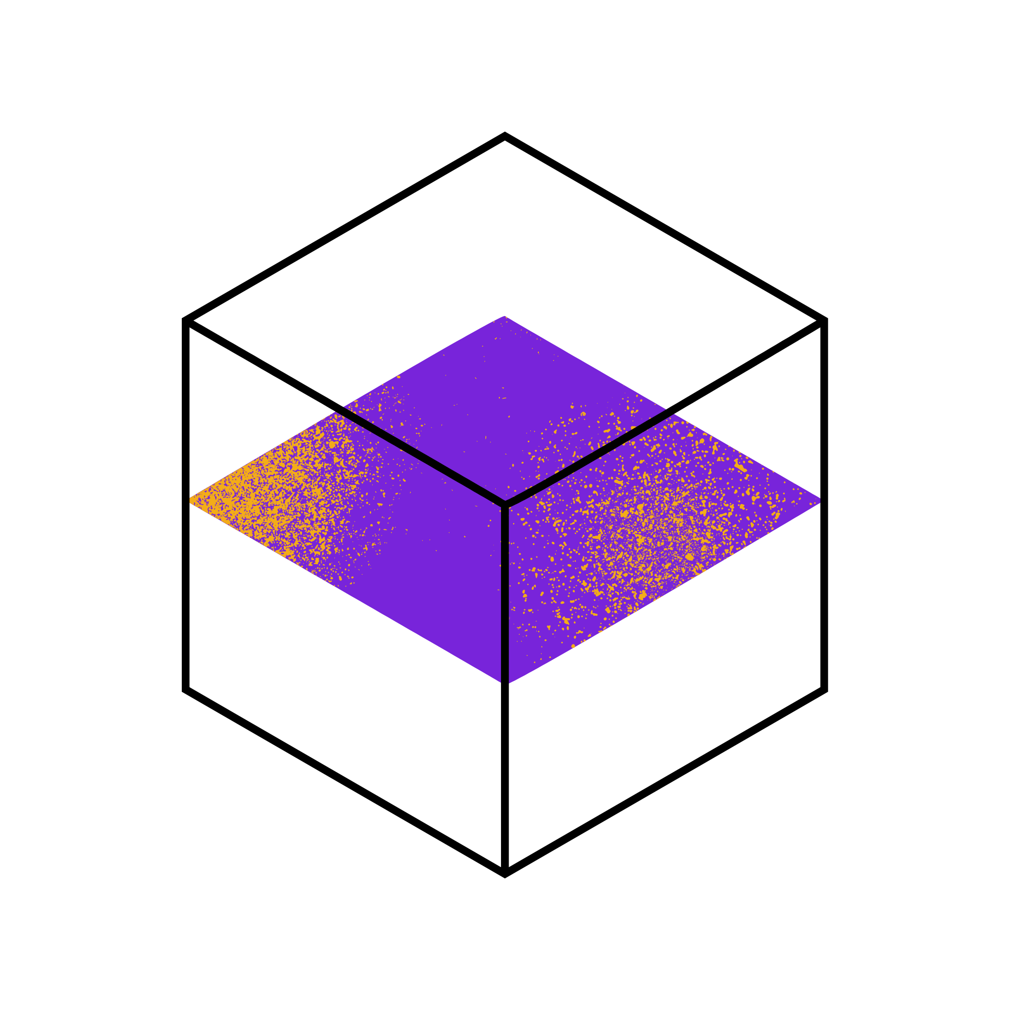
Multi-brand design tokens use a strict three-tier hierarchy - global, alias, and component - to support multiple visual brands from a single component library without duplicating components. Brands swap only the alias tier. Components never reference global tokens directly. The architecture is straightforward; the governance that keeps it from collapsing under brand-specific exceptions is where the real work is.
I have implemented this architecture for systems running three to five brands from a single component library. The technology works reliably. What breaks, consistently, is the governance model - specifically, the moment a brand team needs an exception and the exception bypasses the alias layer. One exception becomes a pattern. The pattern becomes the norm. Within 18 months you have three slightly different design systems wearing the same component library as a costume.
What Is the Three-Tier Model for Multi-Brand Design Tokens?
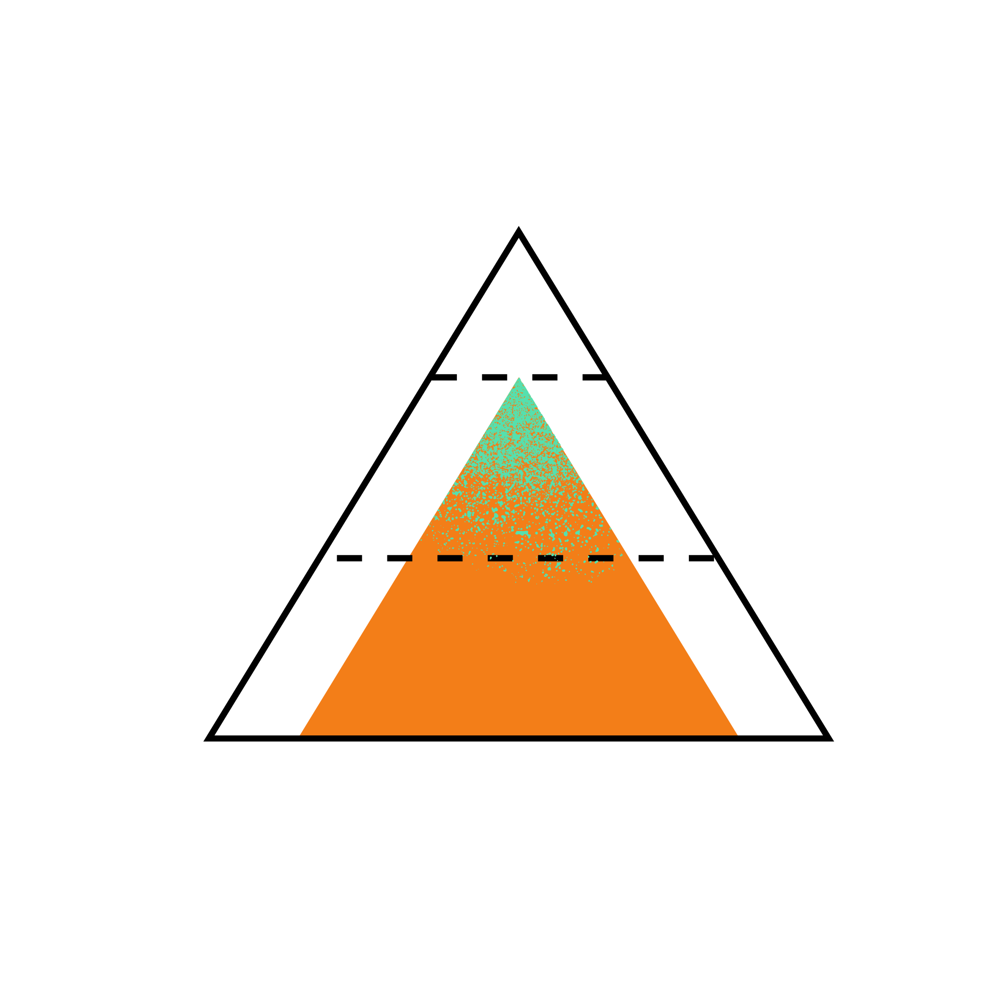
The three-tier model separates design token concerns by their scope and rate of change:
Global tokens are the raw values. Every possible color, spacing unit, font size, and radius value in the extended palette. They are named for what they are, not for what they do: color-blue-500: #0052CC, color-orange-600: #EB5E28, space-4: 16px. Global tokens are the atoms of the system. No component ever references them directly.
Alias tokens are the semantic layer. They reference global tokens and give them a role: color-primary: {color-blue-500}, color-interactive-hover: {color-blue-600}, space-component-padding: {space-4}. This is the tier that brands override. Brand A sets color-primary: {color-blue-500}. Brand B sets color-primary: {color-orange-600}. The role is the same; the resolved value differs.
Component tokens scope semantic values to component contexts: button-bg: {color-primary}, button-bg-hover: {color-interactive-hover}, button-padding-x: {space-component-padding}. Components consume component tokens, not alias tokens directly. This allows component-level overrides without polluting the alias layer.
The flow is one-directional and strictly enforced: global tokens feed alias tokens; alias tokens feed component tokens; components consume component tokens. No skipping tiers.
To make this concrete with two brands:
Brand A (a financial services product) sets its alias tier:
color-primary: {color-blue-500}     → resolves to #0052CC
color-surface: {color-neutral-50}   → resolves to #FAFAFA
Brand B (a consumer product) sets its alias tier:
color-primary: {color-orange-600}   → resolves to #EB5E28
color-surface: {color-warm-50}      → resolves to #FAF7F2
Both brands consume the same component: button-bg: {color-primary}. Brand A’s button is blue. Brand B’s button is orange. The component code is identical. Only the alias tier differs.
The reason for three tiers rather than two is the same as in single-brand token architecture: if components referenced alias tokens directly, brand-specific component overrides would require polluting the alias layer. Component tokens provide the per-component override point without that pollution.
Governance Is the Hard Part. Here Is What Actually Breaks.
The governance model is what keeps the three-tier architecture functional as the system ages and brand teams accumulate exceptions.
The most common failure mode: a brand team needs a color that does not exist in the global tier. The quick solution is to add a brand-specific global token (color-brand-b-teal-500: #00897B) and reference it directly in a component. It bypasses the alias layer. It is expedient, and it is correct for that one component in that one context. It is also the beginning of the end for the architecture.
After twelve months of these exceptions, the system has: brand-specific global tokens that only one brand uses, component tokens that reference global tokens directly (skipping the alias layer), and alias token definitions that are “correct” in documentation but not actually used by the components that were supposed to consume them. The three-tier model is still described in the documentation. It no longer reflects the implementation.
The mechanical defense against this is a Stylelint rule that flags direct global token references in component files. The rule checks every var() in component CSS and rejects any reference that matches the global token naming pattern (typically a prefix like --global- or a palette convention like color-[name]-[number]). This runs in CI and blocks merges that violate the rule.
The rule does not catch everything - approximately 80 to 90% of violations in practice, based on the linting we’ve implemented. A developer who knows the naming convention can work around it with a CSS custom property defined inline. The mechanical rule is necessary but not sufficient. The sufficient condition is team culture: the lint rule signals the standard, and code review enforces it when the lint rule cannot.
For the exceptions that are legitimate - a brand genuinely needs a value that cannot be represented through the alias layer - the correct process is to propose a new alias token, not to reference a global token directly. The alias token is then available to all brands, not just the one that needed it. Over time, this process enriches the alias layer and reduces the frequency of legitimate exceptions.
The Tooling Stack That Works for Multi-Brand Token Pipelines
Style Dictionary is the most flexible build-time tool for multi-brand token pipelines. It handles the transform from DTCG-format JSON to platform-specific outputs (CSS custom properties, SCSS variables, iOS Swift constants, Android XML resources) and supports per-brand output configurations.
A Style Dictionary configuration for a two-brand system looks, at a high level, like this:
- One shared global token JSON file (the full palette: all colors, all spacing, all type scale values)
- One alias token JSON file per brand (Brand A’s alias definitions, Brand B’s alias definitions)
- One component token JSON file shared across brands (or per-brand component overrides if needed)
- One Style Dictionary config per brand that specifies: input files (global + brand alias + component), output format (CSS custom properties), output path (per-brand CSS file)
The build pipeline runs Style Dictionary once per brand and produces brand-specific CSS files. The CSS files are loaded conditionally based on the active brand - typically via a data-brand attribute on the root element and a CSS import strategy, or via a build-time configuration that embeds only the relevant brand’s CSS.
The W3C DTCG format is the recommended source format for the token JSON. Style Dictionary 4.x has native DTCG parsing, which eliminates the custom transform layer that earlier versions required. If you are starting a new multi-brand system, build to DTCG from the beginning - the ecosystem alignment is growing, and retrofitting later is expensive.
Tokens Studio for Figma is the design-side tool that bridges this architecture back to Figma. It supports multiple token sets (one per brand’s alias tier) and a shared set for globals, matching the three-tier model. Designers work in Figma with brand-specific tokens applied; engineers consume the same token JSON that Tokens Studio exports. When a brand updates its primary color in Figma, the change flows through Tokens Studio export, through Style Dictionary, to the brand’s CSS file - without requiring engineering intervention.
What an Ungoverned Multi-Brand System Looks Like After 18 Months
After one year without enforced governance, a multi-brand token system without lint rules and process discipline typically looks like this: the alias tier still exists, but half the components reference global tokens directly. The global tier has accumulated brand-specific values that were added as “temporary” exceptions - Brand A has 12 global tokens only Brand A uses; Brand B has 9. Component tokens are partially correct: the ones from the original architecture are fine; the ones added by teams unfamiliar with the pattern reference whatever tier was convenient at the time.
The remediation cost for this state is significant. In one system I inherited that had been running without governance for 18 months, the audit revealed 140 global token references in component files that should have been alias token references. Resolving them required: identifying which alias token each should have referenced, adding missing alias tokens for the cases where no appropriate alias existed, updating component tokens to reference the correct alias tokens, and re-running visual regression tests against all affected components and both brand outputs. The work took a senior engineer three weeks.
The prevention cost - a Stylelint rule and a documented exception process - is approximately one day. This is the strongest argument for investing in governance tooling before the system reaches production, not after.
Frequently Asked Questions
How do you structure design tokens for multiple brands?
Use a strict three-tier model: global tokens (raw values: specific hex codes, pixel values), alias tokens (semantic roles: one set per brand, overriding color-primary, color-surface, etc.), and component tokens (scoped references to alias tokens). Brands swap only the alias tier. Components consume component tokens that reference alias tokens. Global tokens are never referenced directly in components. Style Dictionary handles the build-time transform from this three-tier JSON structure to per-brand CSS output.
What is the difference between global and alias design tokens?
Global tokens are raw values named for what they are: color-blue-500, space-4, radius-sm. They represent the full palette. Alias tokens reference global tokens and assign semantic roles: color-primary, space-component-padding, radius-interactive. Alias tokens are what brands override - Brand A maps color-primary to color-blue-500; Brand B maps it to color-orange-600. This separation means a brand can change its entire color system by updating alias token references, without touching any component code.
How do you prevent design token drift across brands?
A Stylelint rule that flags direct global token references in component CSS, enforced in CI with merge blocking. A documented exception process that adds new alias tokens instead of global token references. Code review as the last line of defense for what the lint rule misses. In that order.
What tools support multi-brand design token pipelines?
Style Dictionary 4.x (with native DTCG support) is the recommended build-time transform tool. It handles per-brand configuration, multiple input files, and multiple output formats from a single pipeline. Tokens Studio for Figma manages the design-side token sets and syncs to the JSON source files. Stylelint with a custom rule handles governance enforcement in CI. These three tools cover the design-to-code bridge, the build pipeline, and the governance enforcement.
How do you use Style Dictionary for multiple brands?
Create one Style Dictionary configuration file per brand. Each config specifies: the shared global token JSON, the brand-specific alias token JSON, the shared component token JSON, and the output format and path. Running the pipeline produces one CSS file per brand. Load the appropriate CSS file based on the active brand via a data-brand attribute on the root element and CSS variable scoping, or via build-time configuration. The DTCG source format (supported natively in Style Dictionary 4.x) eliminates the custom transform layer that earlier multi-brand pipelines required.
Keep reading
More publications
Web Accessibility Best Practices for Modern Applications
Web accessibility best practices mean embedding WCAG compliance into your token layer, component library, and definition of done - not treating it as an audit phase after the product ships.

AI Code Review for Frontend Teams - Integrating Without Losing Engineering Judgment
AI code review for frontend catches pattern violations fast but risks crowding out the design conversations that build teams. Here is how to integrate it without losing what matters.

Building Scalable Design Systems with AI-Powered Tooling
AI-powered design system tooling automates token auditing, generates first-draft docs, and flags governance violations - freeing senior engineers for decisions only humans can make.
About the author

Sandeep Upadhyay
Principal Architect · Enterprise Design Systems · Accessibility Governance
I architect accessibility-first enterprise design systems deployed across Fortune 500 financial, insurance, and technology organizations, reducing regulatory risk, eliminating duplicate engineering effort, and setting the frontend standards teams build on for years.